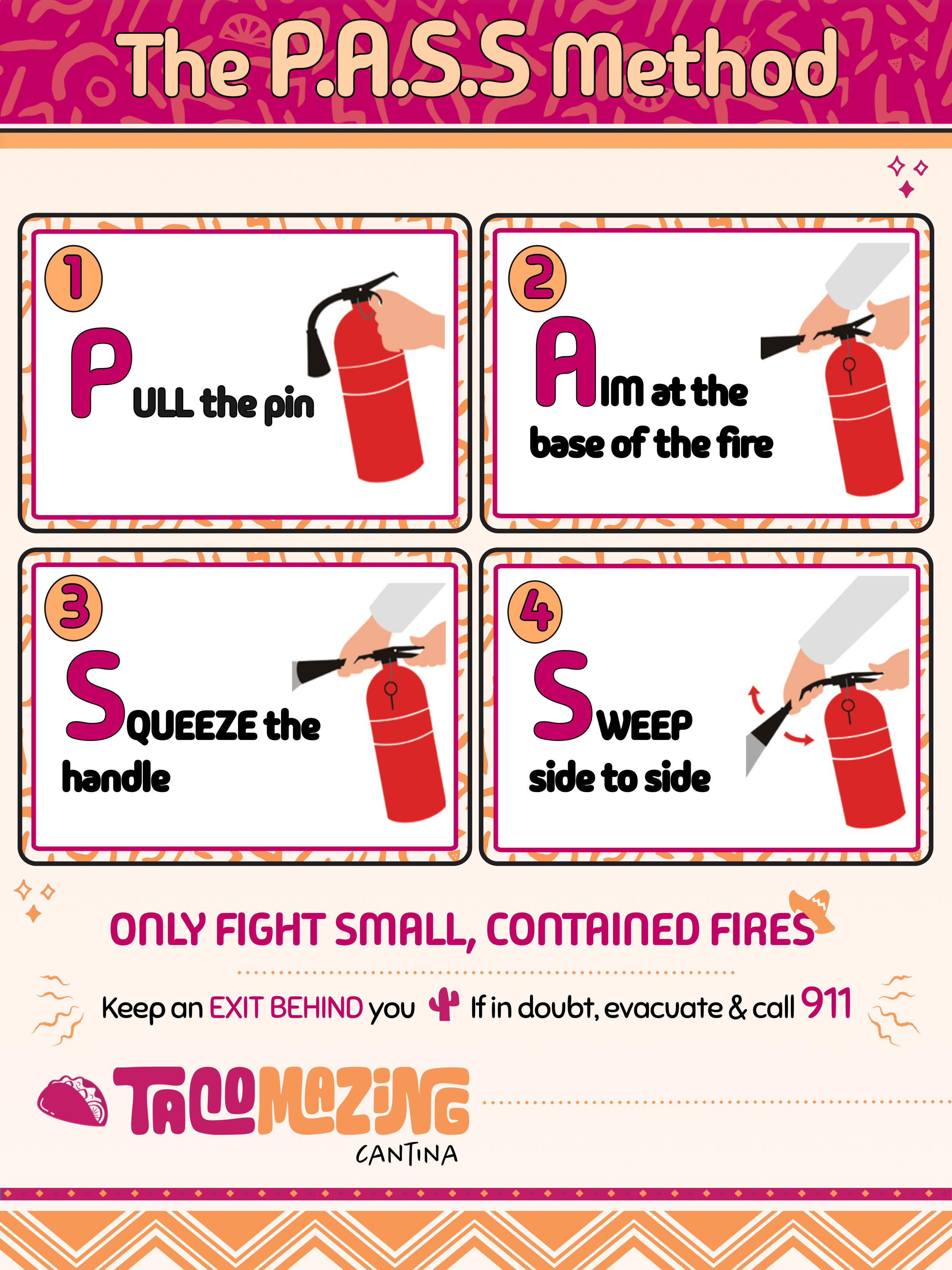
Fire Extinguisher Use for Food Truck Kitchens (P.A.S.S)
THE E-LEARNING DESIGNER’S ACADEMY
E-learning Challenge Entry
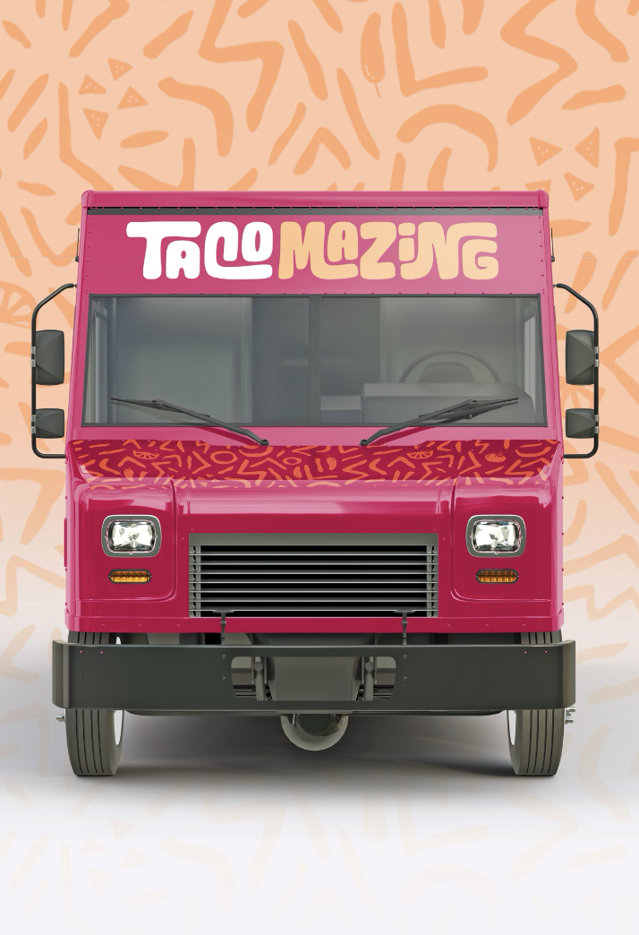
For the January Tim Slade eLearning Design Challenge, I worked within a fictional scenario involving Tacomazing, a food truck brand whose staff lack hands-on experience using fire extinguishers.
The task was to design a printed job aid for display beside on-board fire extinguishers, providing clear, just-in-time guidance during an emergency.
Brief

Target Learner
Tacomazing Food truck staff who may need to use a fire extinguisher during an emergency


Instructional Designer - Job Aid Design
My Role
Figma
Canva
Tools Used

-
In the scenario, Tacomazing staff have limited experience using fire extinguishers but operate in fast-paced environments where fire risks are present. In an emergency, staff must make rapid decisions with little time for instruction or recall. This creates a need for concise, visible guidance that supports correct action and reinforces when it is unsafe to attempt to fight a fire.
-
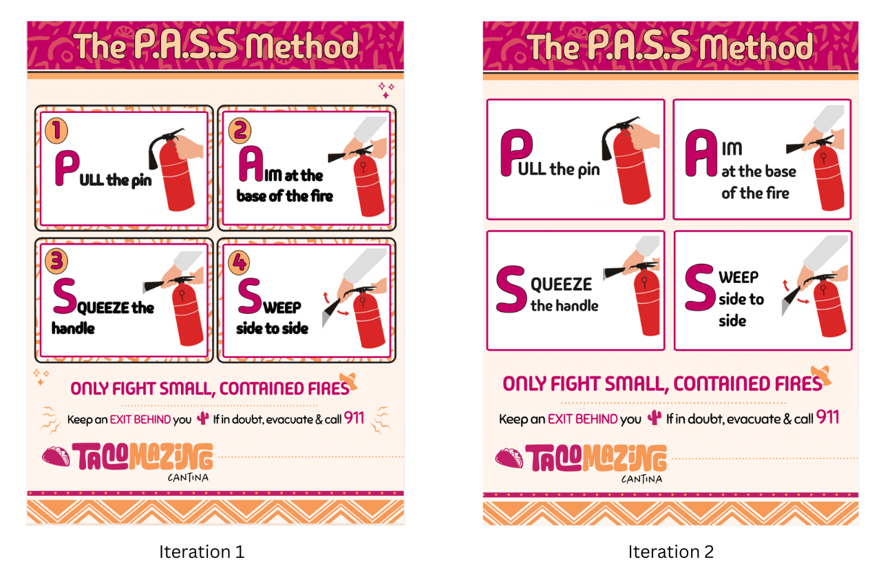
The solution was a printed job aid designed for placement beside on-board fire extinguishers. Using the P.A.S.S. method, the job aid provides a clear visual sequence with minimal text to support fast, correct action under pressure, while reinforcing when evacuation is the safest response.
Design and Development
I kept the design process for this project deliberately simple. I looked at a range of existing fire extinguisher job aids and examples of the P.A.S.S. method to get a feel for what already works well in safety contexts.
The brief included Tacomazing’s brand colours, fonts, and graphic elements, which made it easier to design something that felt realistic and grounded in a real workplace setting. I started with a quick paper sketch to think through layout and hierarchy, then moved straight into building the design.
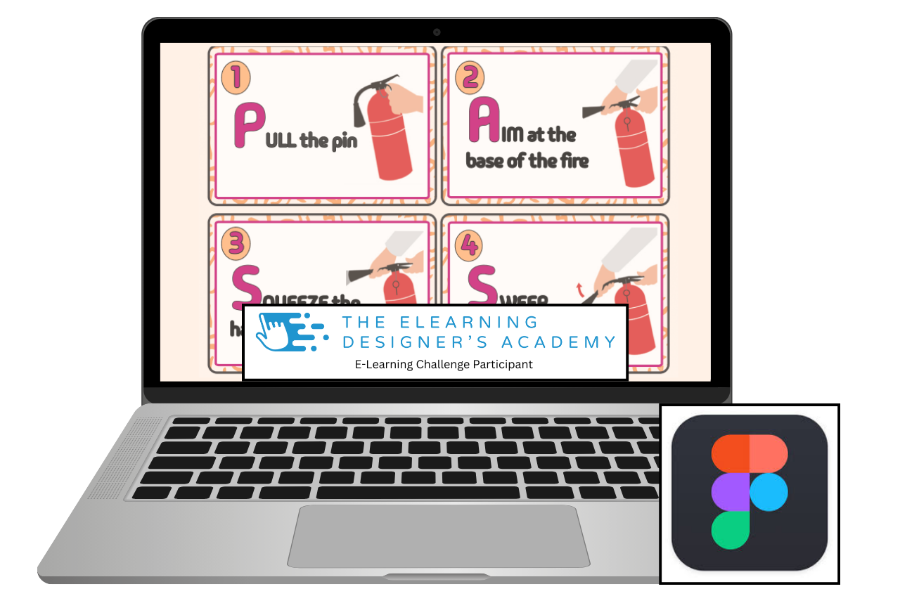
For this project, I decided to try Figma for the first time. While it was new to me, I found it fairly intuitive and quick to pick up, with similarities to Canva that made it easy to get started and work efficiently within a short timeframe.
The layout didn’t change dramatically, but I did make one key adjustment. I initially explored a clockwise flow using arrows and numbers, then realised that in an emergency situation people don’t have the time or headspace to interpret directional cues. The final design relies on clear numbering and a straightforward reading order to make the steps as obvious and easy to follow as possible during a fire emergency.


Reflection
I really enjoyed this project. Although the guidance suggested using a familiar design tool, I used it as an opportunity to try something new and gave Figma a go. It was my first time using it, but I found it intuitive and manageable within a short timeframe.
Having access to a clear style guide was surprisingly helpful. It gave me direction, helped rein in my natural tendency to overdesign, and made the process feel more focused. One of the biggest challenges for me was resisting the urge to add too much information or too many decorative elements, and instead trusting simplicity to do the work.
I also found sourcing appropriate imagery for the P.A.S.S. process more challenging than expected. I initially experimented with AI-generated images, but they didn’t align with the visual style I was aiming for. In the end, I adapted royalty-free safety imagery and integrated it into the design in a way that felt consistent with the overall look and purpose of the job aid.
A clear next step for me is to further develop my use of AI as a design support tool, particularly for creating or refining bespoke visuals that better align with brand and context. Building confidence in this area would allow me to rely less on stock imagery and create more tailored visual assets in future projects.
Iteration and Feedback
After sharing the initial version of the job aid, I received some helpful feedback that prompted me to revisit the design. This led to a second iteration where I:
removed the step numbering,
tightened up the P.A.S.S. text,
stripped back some of the more decorative elements.
While it meant letting go of a few visual details I liked, the revised version feels noticeably cleaner and calmer. For a job aid intended to be used in an emergency, this reinforced an important lesson for me: clarity and ease of use matter far more than visual embellishment, even when strong branding is still maintained.
Although the revised version was not resubmitted as part of the challenge, I used the feedback as an opportunity to reflect and improve the design beyond the original brief. This process highlighted the value of a human–AI–human approach, where AI can support speed and accuracy in early stages, and human feedback plays a critical role in refining judgement, clarity, and real-world usability.