
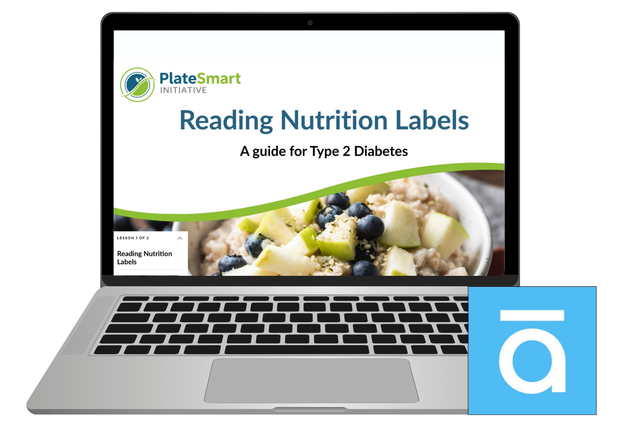
Reading Nutrition Labels
This started as a Tim Slade e-learning challenge and an excuse to build something in Rise. I used the PlateSmart Initiative context, where coaches had flagged a real issue. Clients were given plans, but struggled to follow them because they couldn’t confidently read nutrition labels or decide if a food was a good choice for their condition.
Food labels carry a lot of information, but without knowing what to focus on, it can feel like trying to read code in the middle of a supermarket. The goal for this project was to move beyond explaining labels, and instead help learners practise interpreting them and making quick, realistic decisions.
Brief

Target Learner
PlateSmart clients managing health conditions such as type 2 diabetes


Instructional Designer, PlateSmart Initiative project
Scenario based microlearning design and build
My Role
Articulate Rise 360
Mighty Plugin
Canva
AI supported HTML and JavaScript
Tools Used

-
Clients are expected to use nutrition labels to guide their food choices, but often lack confidence in how to interpret them. Coaches were also spending a significant amount of time front loading this information, which wasn’t the most effective use of their time and could be better supported through self guided learning. In a real world setting, such as standing in a supermarket, labels present a large amount of information with little guidance on what is most relevant, making it difficult to quickly identify suitable options, particularly for those managing conditions like diabetes.and reinforces when it is unsafe to attempt to fight a fire.
-
A short, scenario based module designed to build confidence in interpreting nutrition labels before working with a coach. The design narrows attention to key indicators such as carbohydrates, sugars and fibre, and provides opportunities to practise making decisions in realistic contexts, supporting faster and more confident choices. Positioned as a pre knowledge task, it allows coaching sessions to focus on application and individual support rather than covering the basics.
Storyboarded in Google Sites
Design and Development
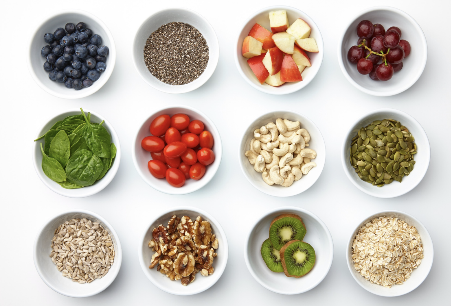
I started by researching what information someone with type 2 diabetes actually needs from a nutrition label, which helped narrow the focus early. I knew I didn’t want this to turn into a “read then quiz” experience, so I built the module around a simple scenario. Miriam was introduced as a relatable case study, giving the learner a way to apply what they were learning in context rather than just absorbing information. Setting it in New Zealand and using familiar, everyday foods helped keep it grounded and realistic.
The experience was storyboarded in Google Slides as a visual mock up before building. I went into this intending to use Articulate, but wasn’t sure whether Storyline or Rise would be the better fit. I chose to push Rise as far as I could, using the Mighty plugin to extend what was possible. Without that, the design would have needed to be simplified. At one point I explored building a supermarket style interface where learners could “shop” and make decisions, but quickly realised this would require custom HTML. This was completely new to me, so I used AI to help bring some of those ideas to life in a more achievable way.
One of the biggest challenges was keeping the experience focused. It was easy for the content to drift into long explanations or repetitive question blocks, so I had to keep pulling it back to what actually mattered. The introduction of the CSF check gave the module a clear anchor point, something simple, repeatable, and easy to recall in a real world setting. I also chose to cut a planned dinner section, as it was starting to repeat the same thinking and didn’t add anything new.


Reflection
This project didn’t follow a clean, linear process. It evolved as I went, which made it difficult to build momentum early on. I didn’t always have a clear picture of what I was building, and often found myself designing in reverse, realising what needed to be added or adapted as I progressed. It felt stop start at times, and ultimately it took a while to really “click”.
The turning point came when the ideas started to anchor. Creating the CSF check gave the learning a clear structure and something memorable to hold onto, and developing Miriam as a relatable character helped ground decisions in real life rather than generic advice. That shift made everything feel more purposeful and easier to build around.
This project reinforced the importance of seeing something through, even when it feels messy or unclear. It also forced me to simplify, focusing on what is actually useful and achievable in everyday life rather than idealised advice that doesn’t stick.
If I were to approach it again, I would explore building it in Storyline or a tool like Chameleon Creator to allow for more flexibility in interaction design. That said, it gave me confidence in how far I can push Rise, and in using AI to support technical elements like HTML when I don’t have that knowledge upfront.